Benefits of Bamboo Solutions’ Carousel by Bamboo Web Part
Compared to SharePoint Out-of-the-Box Image Web Parts
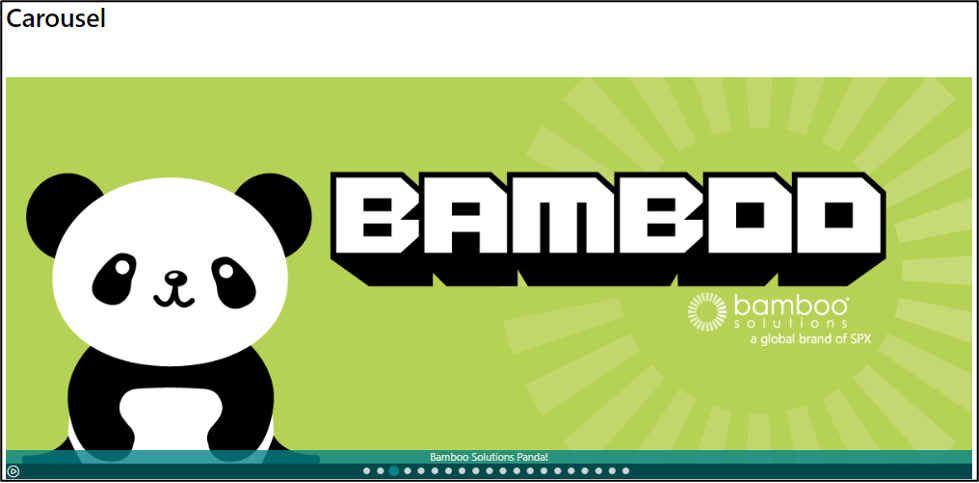
Bamboo Solutions’ Carousel product is an off-the-shelf SharePoint web part that allows you to cycle through images on a modern SharePoint Online page. It has multiple options to customize and maximize your organization’s media with smooth, sleek performance. Its ability to match your company theming will make Carousel by Bamboo look like it was personally designed for your home portal.
Bamboo’s Carousel offers much more than just a basic cycle of images, though, and we’ll highlight these extra features in this article. We’ll also compare Bamboo’s Carousel features with the SharePoint Online out-of-the-box (OOB) image display options. These SharePoint OOB options include Hero, Image, and Image Display web parts (Fig 1). The closest of these three options to Carousel by Bamboo Solutions is the ‘Image Display’ Web Part, as it has a “carousel” layout option in the settings.
Fig 1 – Carousel by Bamboo has many more features vs. OOB SharePoint Options
Carousel by Bamboo Set Up
When setting up Carousel by Bamboo, the web part will walk you through a process that creates a dedicated library. This library will be housed in the site collection you are currently in. The image library can be accessed by any other Carousel by Bamboo web part on any other page or site collection. You will need to have permission to this website (the created library is set to your site collection’s inherited permissions). You can also use the web part to create multiple different libraries in the event there are different use cases for your company. After uploading your images into the library, you then have the option to add metadata for your images.
Metadata
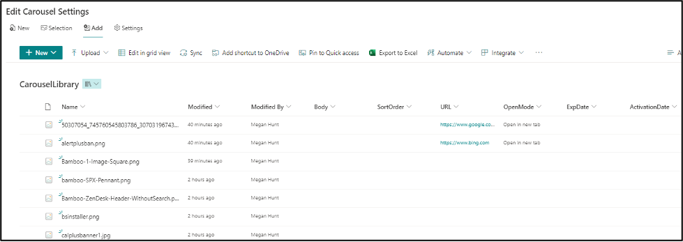
The library generated by the web part comes with default metadata columns that the web part uses to maximize the customizable options available within Carousel. (Fig 2)
Fig 2 Metadata is used to enhance the user experience when interacting with Carousel by Bamboo
Metadata Columns
- Body
- This is a multiline text column that will appear as a caption on a translucent ribbon at the bottom of the image; captions can be wrapped.
- SortOrder
- This is used by the Carousel web part to determine in what order the images should appear.
- URL
- This assigns a link to the image, so when the image is clicked, it will open this link.
- OpenMode
- Choose whether the link should open in the same tab or a new tab when clicked.
- ExpDate
- Assign the image an expiration date on which it should stop appearing in the Carousel web part. This will not remove it from the library; it will just remove it from the slider if the expiry date has passed.
- ActivationDate
- Assign the image an activation date on which it should start appearing in the Carousel web part. Prior to this date, the image will not appear. This allows you to prep images before it’s time for them to launch and not have to go back later to activate them.
These metadata columns are optional and are not required for the web part to function. In addition, while the Carousel by Bamboo web part can be used to add/edit the metadata for these images, you can also navigate to the library in your Site Contents and update the information directly. Any Carousel by Bamboo web part, be it two on the same page, or one on a completely different site collection, can source the data from that library for its images.
Display Settings
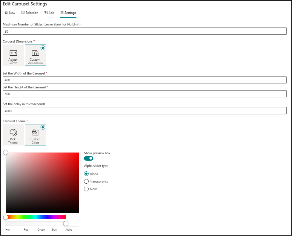
Once the images are uploaded and set up as needed, the Carousel web part by Bamboo Solutions guides the user in setting up the display settings for the web part itself (Fig 3).
- Carousel by Bamboo offers the ability to set a maximum number of slides to display on that instance of the web part.
- There are two options offered for dimensions: Adjust Width and Custom Dimension. When Adjust Width is selected, the web part will automatically change height and width depending upon the native size of the image that is being shown. If Custom Dimension is selected as the dimension setting, the width and height can be set by pixels.
- Carousel by Bamboo also has an area to define the amount of time that should expire before it switches to the next image in line.
- Carousel by Bamboo has two options for theming the colors of the web part. The first option is to pick a theme that will match the color theming on the current site collection. The other option is to select a custom color, which allows you to pick from the full spectrum of colors for texts and backgrounds.
The settings that are established on one Carousel web part instance may be completely different from the settings that are established on another instance of the web part, even if they are using the same image library as their data source.
Figure 3 – Setting up display options such as the Maximum Number of Slides as well as custom Width and Height is simple.
Display Options
Once Carousel by Bamboo has been set up and saved, the web part will begin displaying on the page as directed. There are several key things about Carousel by Bamboo’s display options that are unique and unparalleled by anything SharePoint out-of-the-box has to offer. There are many unique settings, but we’ll cover four here.
- First, Carousel by Bamboo’s web part has a “pause/play” button in the bottom left-hand corner that allows someone who is accessing that page the ability to pause or play the slider.
- Second, our images can have unique and dedicated links assigned to them, so when the image is clicked, it will open that link in a new tab or window.
- Third, there is an image ticker on the bottom of the image so that a user can click to navigate to a specific image without having to cycle through all the ones before it.
- Lastly, our images have an aesthetically pleasing fade-out and fade-in feature upon switching, so the change between images is not jolting or clunky.
OOB SharePoint Image Gallery Comparison
When comparing Bamboo’s web part to OOB SharePoint, the SharePoint web part ‘Image Gallery’ has the closest option to display images in a similar manner as the Carousel by Bamboo web part. The OOB view has a ‘carousel’ layout option in addition to the other two layout options: grid and brick. (Fig 4)
Figure 4 An example of the SharePoint out-of-the-box web part Image Gallery using the carousel layout.
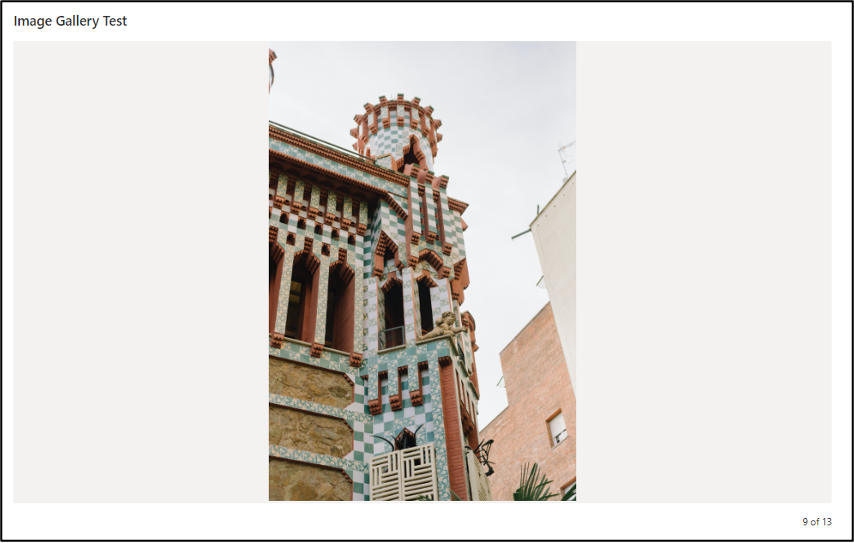
- There is no “pause/play” button on the bottom left of the screen to control the switch, nor is there an image navigation area to jump images quickly.
- There is quite a bit of white space around this image. This is because every image in the OOB SharePoint Image Gallery web part is subject to the dimensions of the largest image in the batch, which sets the dimensions of the web part, and then all the other images fill the gap with white space.
- There is no image caption, as the OOB carousel from SharePoint has no feature to caption the image.
Those are just the things you can see on the front end. Behind the scenes, there are many features that Carousel by Bamboo has that the Image Gallery does not. These behind-the-scenes differences include the following.
- Image Gallery relies on direct image upload or using an existing document library to supply the media. Direct image uploads are automatically placed in Site Assets->Site Pages->pagename, where the web part is located. Where these images are stored cannot be changed or redirected.
- When using the option to pull media from existing libraries, the images are not able to be captioned.
- Images cannot be assigned any metadata that the web part will use for customization.
- Images cannot be assigned links as they can in Carousel by Bamboo.
- When pulling from an existing library, there is an option to cap the number of images but not a way to select which images are shown.
- There is a min/max on how many seconds can be between image changes. Carousel by Bamboo has no min/max restrictions.
Outside of the OOB SharePoint carousel layout with the Image Gallery, the two other OOB layout options are grid and brick. These are static image display options; the images do not rotate. Images can be assigned titles and captions, but not links. Titles and captions only appear for these images, though, when they are clicked on and open in full-screen mode. In the grid layout, a user can assign the same aspect ratio for all images, which leaves some images cut off or with large amounts of white space. In the brick layout, the images all use their native ratio; images cannot be reordered in this layout. Obviously, these two layout options aren’t really in the same category as the carousel layout for Image Gallery and Carousel by Bamboo, but they are another SharePoint OOB web part for displaying images and thus worth mentioning.
Hero and Image Comparison
Two other web parts offered by SharePoint OOB to display images are the Hero web part and the Image web part. As mentioned above, these are methods of displaying static images, so they are not entirely in the same category as Carousel by Bamboo. Still, it goes to show how limited the options for displaying images are when trying to use SharePoint out-of-the-box web parts. (Fig 5)
Figure 5: The Hero, web part layout, is not a carousel but also has limitations that can frustrate designers and users.
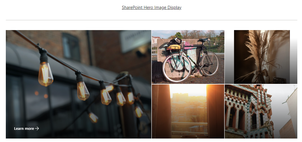
- Changing the number of images from between 1 and 5 panels maximum.
- Only the largest image can be given an informational link (the “Learn more -> text).
- Image size is unable to be controlled. However, there is a zoom feature and the ability to set an image focal point.
- Images can have titles, but they aren’t customizable, and they are on top of the picture.
- Images must be uploaded one at a time, and the images are automatically uploaded to Site Assets->Site Pages->pagename, where the web part is located.
The last OOB option is the simplest, SharePoint Image Display web part. (Fig 6)
Figure 6: This is what the SharePoint Image Display web part looks like.

There is no reason why you can’t have a single image in the Carousel by Bamboo web part and still have access to all its other features.
508 Compliance
In addition to all the features and benefits mentioned above, Carousel by Bamboo is fully 508 compliant. It is the only viable image option for organizations such as government entities that require their portals to be inclusive to the visually impaired.
Summary
Carousel by Bamboo really has no equal when choosing from the SharePoint out-of-the-box image display web parts. The closest option that compares is the carousel layout within the Image Gallery web part. However, it is evident by the comparison above that Carousel by Bamboo is a web part designed to act as an image carousel, not as an afterthought. Carousel by Bamboo is an image slider/carousel solution with multiple options to customize and maximize an organization’s media. The smooth, sleek performance and capacity to match company theming will make Carousel by Bamboo look like it was personally designed for your home portal.

